
A gentle digital refresh for a purpose driven coaching & mentoring service
From clunky to clean… This thoughtful redesign and a platform shift from Wordpress to Rocketspark gave a heart-led service for neurodiverse individuals the clarity, calm and care it truly deserved.


The Client
AutSupport.nz is a coaching and mentoring service supporting families of neurodivergent individuals, both in New Zealand and globally.
With offerings like 1:1 coaching for caregivers and mentoring for neurodivergent youth, AutSupport’s work blends empathy and lived experience to provide a safe space for connection and growth.
But, the old WordPress website, whilst OK as a starter foundation, didn’t truly reflect the power of AutSupport’s purpose. It was a hard platform for Iain, the client, to use and keep the website updated due to a cumbersome “back-end”.
It was time to find an easier to use, intuitive platform and to give the brand a refresh.
The Challenge
Whilst the WordPress site had strong branding baked in, it:
felt clunky & out-dated
was hard for Iain to update & keep secure
required huge amounts of complex back-end management
didn’t truly reflect AutSupport’s mission
We needed to find a more streamlined, easy-to-use platform that would allow Iain to update the website content independently, and a platform that would provide a cleaner, less cluttered finish… enter Rocketspark!
Scope of the work
Logo design
Branding colours
Cohesive typology
Refresh:
Copy-writing
Image curation
Web design refresh
The original logo brief given to Volar Creative Studio was a tree and rainbow reflecting in a pool of water.
I worked with Iain to simplify this brief by suggesting a strong tree trunk with the leaves coloured by the spectrum of the rainbow to represent the autistic and neurodivergent spectrum.
The resulting image of two trunks coming together as one signals the strength of support provided by Iain and AutSupport’s mission to walk alongside families as they navigate their journeys.
I created a range of logo marks, including for Iain’s two signature service offerings - AutCoach and AutMentor.


Our process working together over time…
Branding
From roots to refinement
The original brand used colours from the tree leaves in the logo. We used blues, orange and yellows as these colours are known to evoke a distinct emotional response.
Yellow is associated with optimism, clarity and happiness.
Blue is linked to calmness, trust, professionalism and stability.
Orange combines elements of both, representing friendliness, confidence and enthusiasm.
These are all elements that AutSupport.nz seeks to be and create through its work.
As part of the website rebranding we introduced a paler blue and yellow into the palette as calming accent colours, and refined the original typography to remove the Linotype Feltpen and create greater cohesion across the fonts for a cleaner look and feel.


Hover over the image to see these subtle branding changes.
Refreshed brand colours and typography
Copy-writing & Image Curation
From practical to personal
The original copy was functional but could feel a bit clinical at times. So we worked on tone and amount of content so that it became clearer and more compassionate. It now better reflects Iain’s voice and intention and his sensitive nature. We also updated some of the imagery to feel more diverse and emotionally resonant with the community Iain serves.


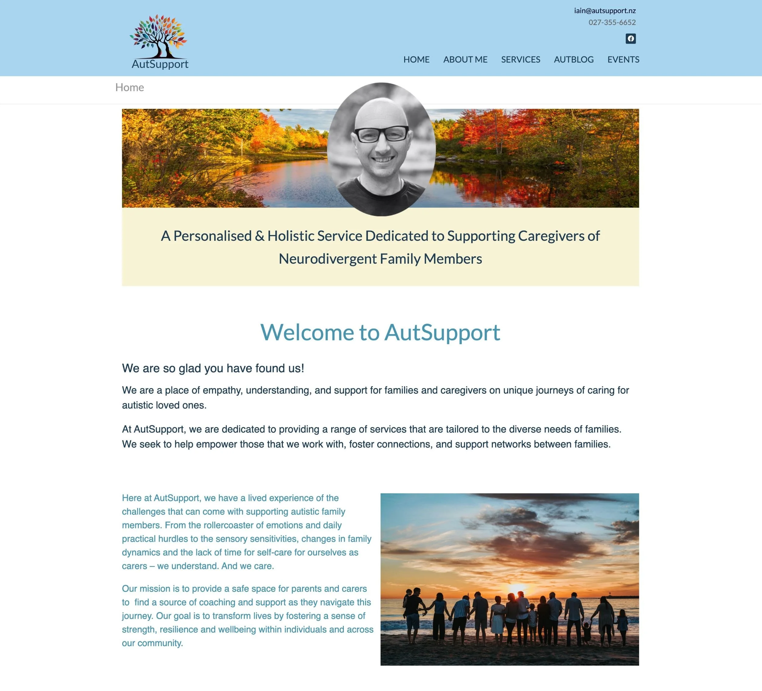
Hover over the image to see these subtle copy-writing changes from the old to the new.
Refreshed copy-writing and hero image
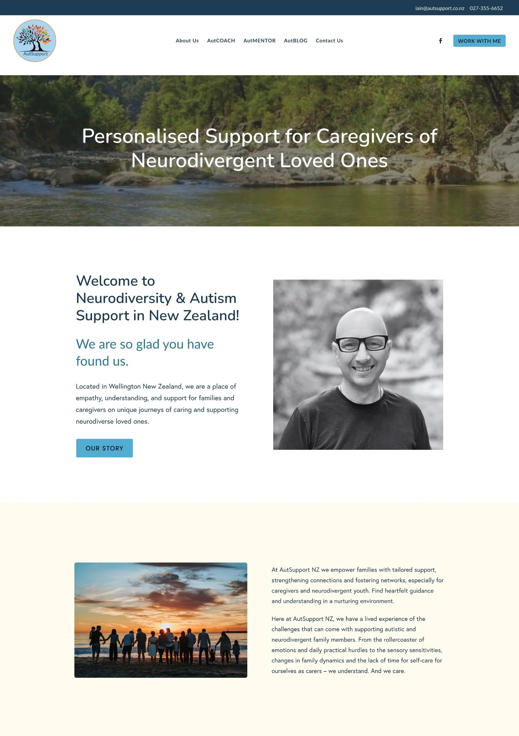
Website Design & Wireframing
From content-heavy to calm & clear
The original site had lots of valuable information, but the Wordpress template being used required more breathing room. We restructured the layout and wireframed with clarity in mind, simplifying the navigation and segmenting content into digestible sections to help with the processing of information and flow. We added clear Call to Action buttons in appropriate places.
Hover over the image to see these layout changes from the old to the new.
Refreshed layout on AutMentor page
Platform Switch
From workarounds to ease
Initially built on Wordpress, the site had become cumbersome for Iain to manage without support. As we reimagined the experience, I recommended Iain move to Rocketspark as it would offer Iain a much simpler, more intuitive back-end without compromising design integrity. This shift was all about sustainable ownership and easily updating content in future.


Website Refresh & Launch
From one-time project to long-term evolution
What began as a site refresh became a full strategic re-platforming and launch!
By switching platform, revisiting every page, piece of copy and technical integration, we created something that not only looks massively better, but also functions way more intuitively.
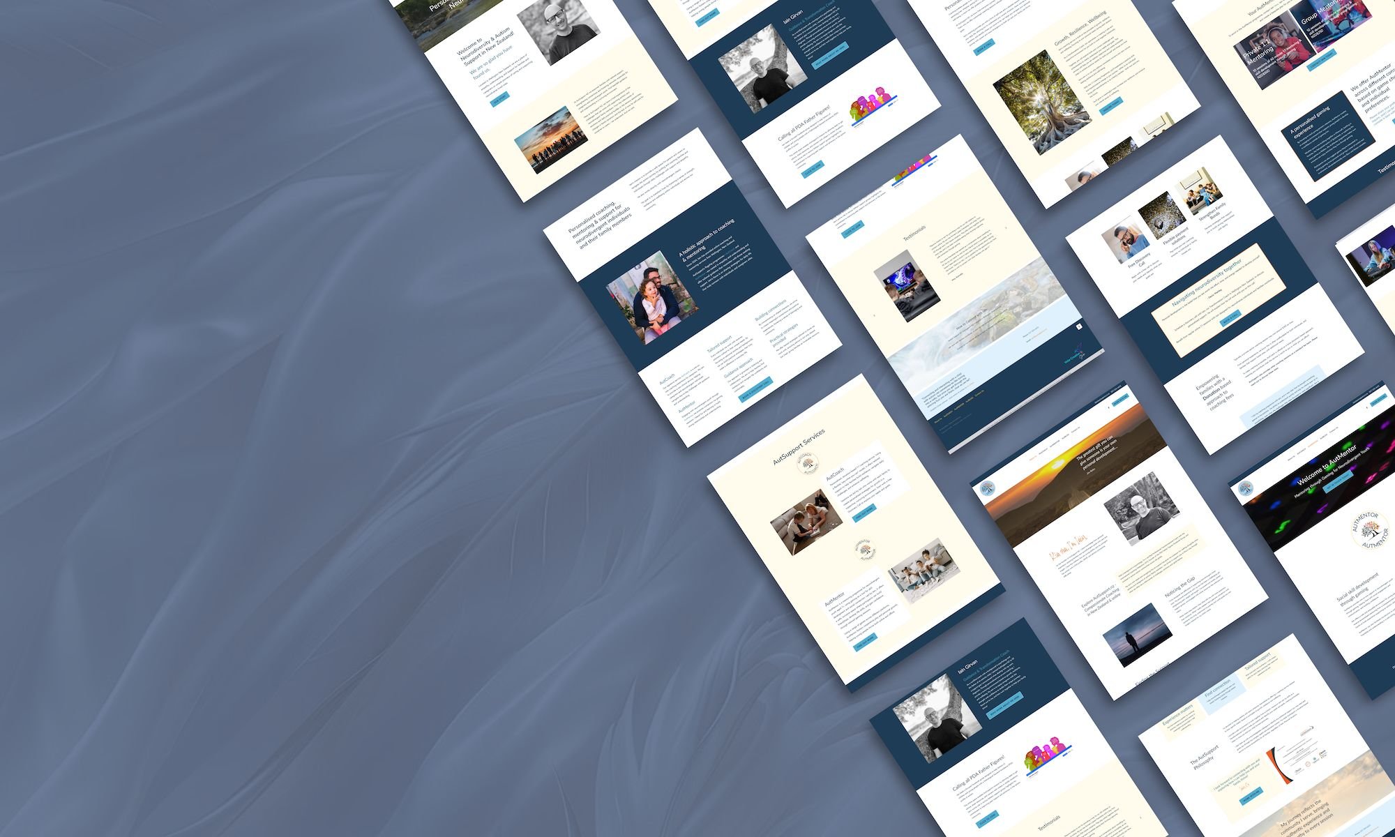
Before & After
The Transformation at a Glance
Home Page——————
From content rich to content calm → intuitive, warm & welcoming
The original home page felt crowded and text heavy, with minimal structure to guide visitors. Important messages were buried, and the overall aesthetic didn’t reflect the warmth or clarity of the services.
The refreshed home page introduces gentle flow, clear navigation and thoughtful visual balance.
With space to breathe and a stronger visual hierarchy, visitors are welcomed and guided seamlessly to where they need to go.

AutCoach
——————
From content rich but hard to navigate → calm, clear clean, and structured for ease
The original AutCoach page lacked visual rhythm and structure, with long sections of dense text and minimal visual guidance. While the message was meaningful, the delivery in layout made it hard for visitors to navigate or engage in the content.
The refreshed layout breaks content into digestible, inviting sections that help guide the reader through the content.
Supporting visuals and headings now frame the core message, making it easier for parents, caregivers and individuals to understand the information quickly and find the support they need.

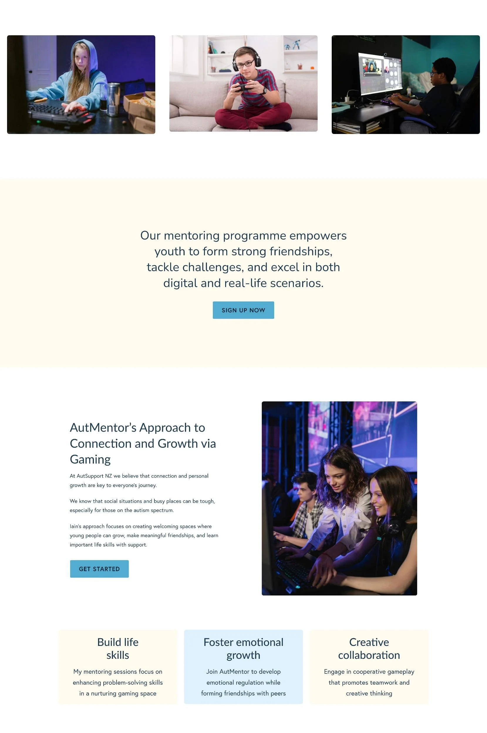
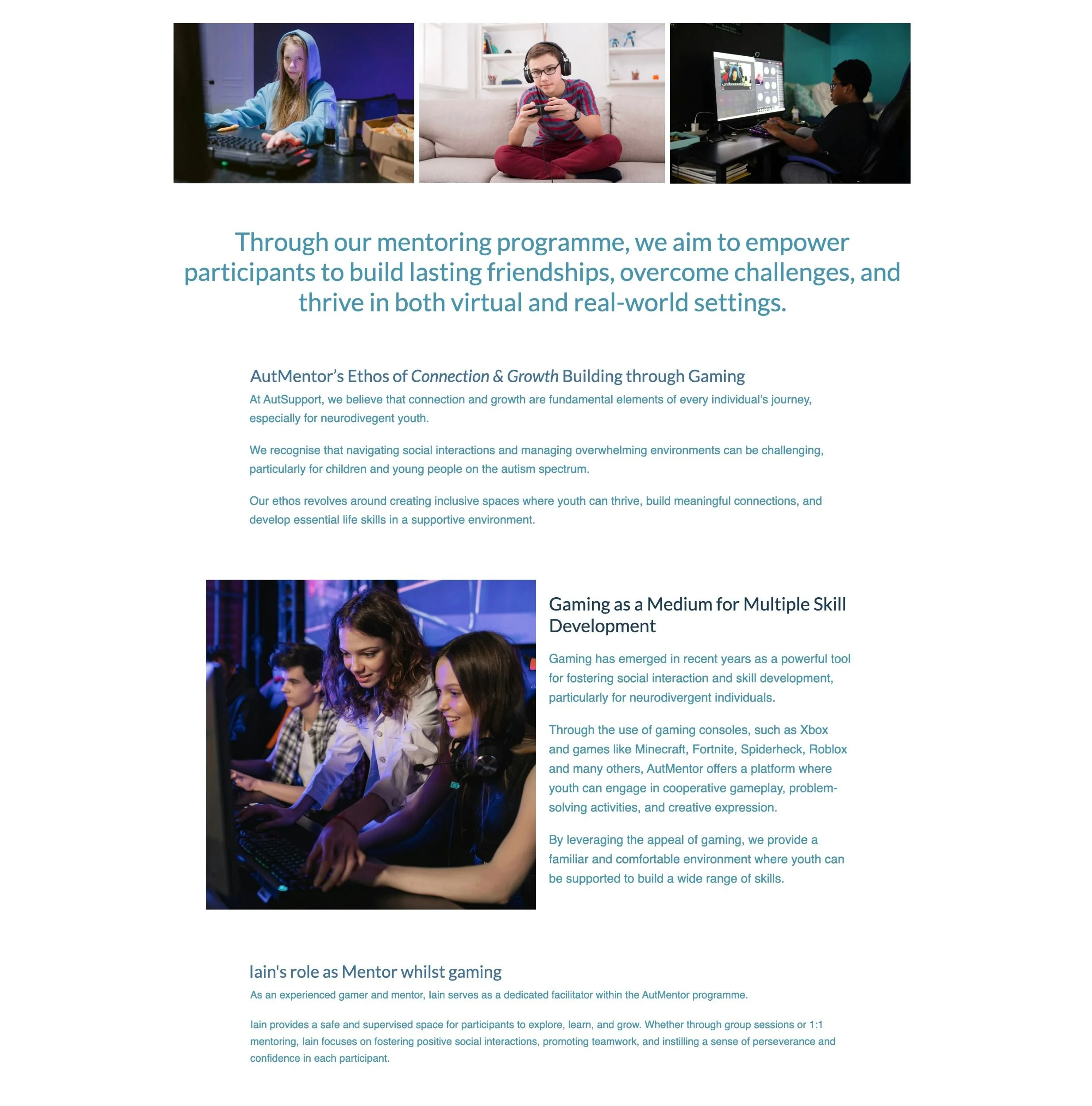
AutMentor——————
From visually cluttered → inviting & connection focused
The original AutMentor paged housed powerful ideas but felt cluttered and visually heavy. With limited visual storytelling and no clear hierarchy, visitors had to work hard to understand the offering.
The new page introduces breathing room, clear pathways and calls to action, and an intuitive flow of information. Strong headlines and purposeful imagery now reflect the heart of AutMentor’s purpose as a programme for neurodivergent youth.

About
——————
From heartfelt but heavy → grounded, spacious & trustworthy
While heartfelt and honest, the original About page presented content in a way that was text-heavy and hard to skim. The design didn’t support the professionalism and empathy behind the service.
The updated About page feels grounded, personal and clear. The story shines, now supported by a thoughtful layout and visual structure to create a brand-aligned presence that builds trust from the start.


“Hannah helped me develop and tighten my business concept. I had a broad idea of what I wanted to do but Hannah helped me to really focus in on what I was offering and what value it will bring to my clients. She also truly listened to what was important to me and helped to build that into the web design ideas and the story I was trying to tell. I love my logo as it really reflects what I want to communicate as the essence of my coaching services. Hannah takes the time to understand you, and works to gently draw out the heart of what you are trying to achieve. I am really pleased with my refreshed website!”

Curious how your website could evolve too?
Thinking about refreshing your existing site?
Explore the Featherlight Refresh package →
Let’s map your next move.