
These are projects for businesses and organisations working in wellbeing, hospitality, community and place, where how its branding and site feels matters as much as how it works.
Featured Work
These projects represent the direction of my studio today - a mix of client work and carefully considered concept pieces exploring spaces I'm most drawn to. My goal is always to support people, communities, and place through thoughtful brand and website design.
AutSupport NZ
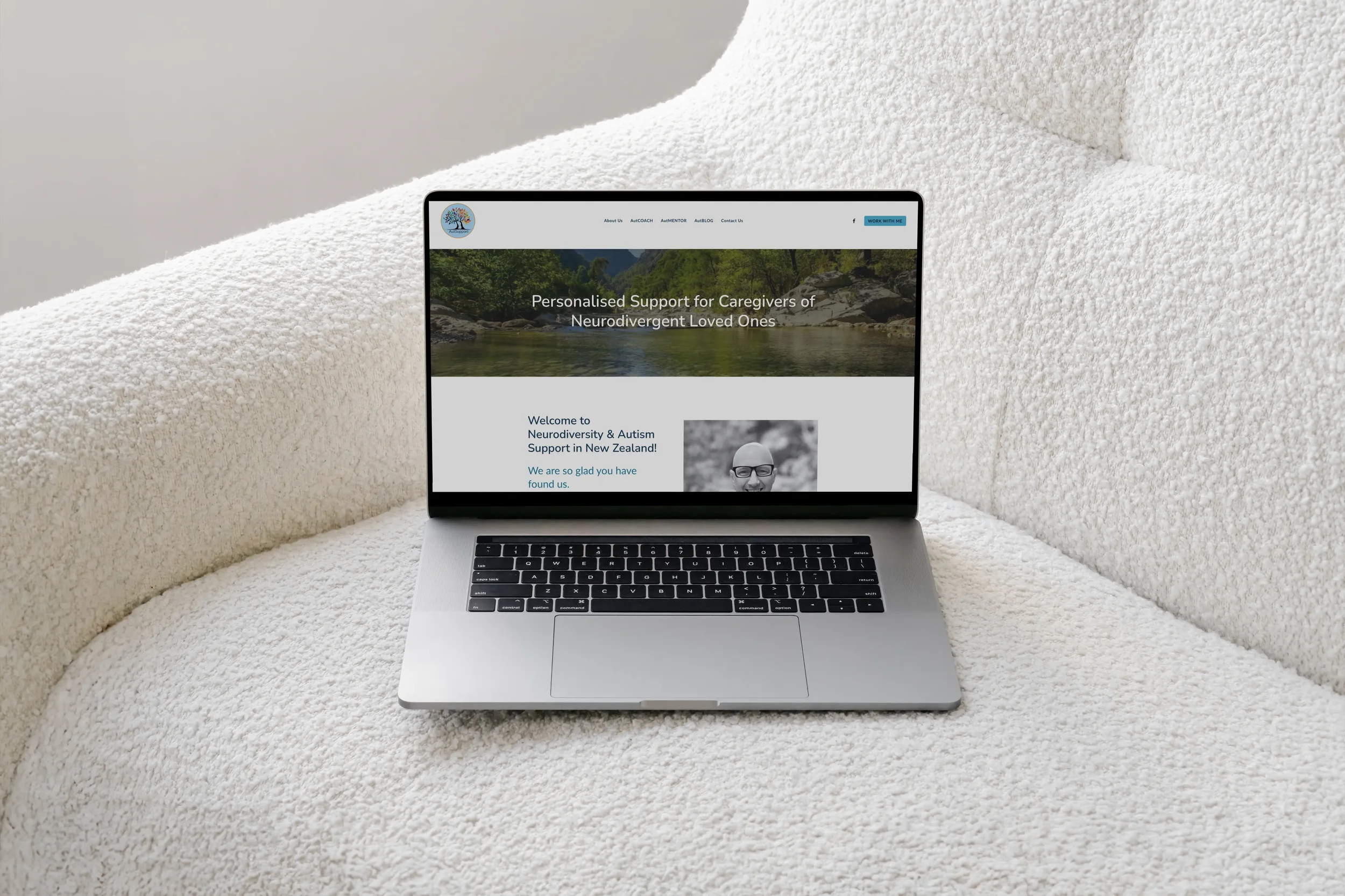
Purpose-led branding and website refresh
A gentle evolution of an existing identity for this transformation coach, paired with a migration to Rocketspark from Wordpress, resulting in a calm, accessible website. Designed to support neurodivergent users and their families through clear structure, intuitive navigation, and inclusive design choices.
Brand refresh ✦ Rocketspark ✦ Multi-page ✦ Accessibility focus
The Unbound Canvas
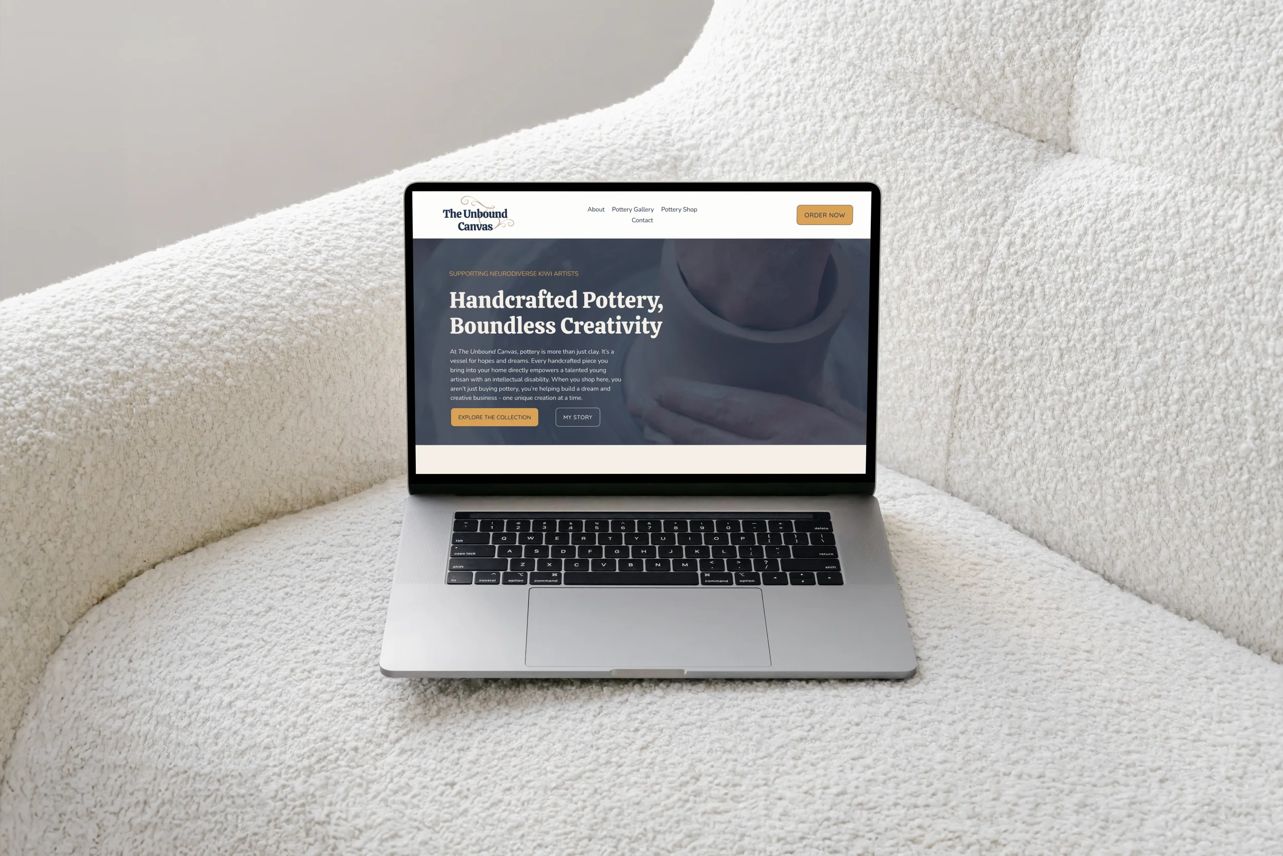
Handcrafted pottery website for a neurodiverse artist building a creative business on his own terms
A warm, story-centred Squarespace website designed to showcase Louis's wheel-thrown and hand-made pottery while putting the maker front and centre. The site guides visitors from emotional connection to inquiry by introducing the artist, presenting small-batch releases in a gallery-quality layout, and channelling interest into a considered commission flow for custom and pet portrait work. Orders are made via a form-based approach to reflect the small-batch production approach for a new small creative business.
Squarespace ✦ Brand identity ✦ Gallery ✦ Inquiry-based conversion
Serenity Path Retreat
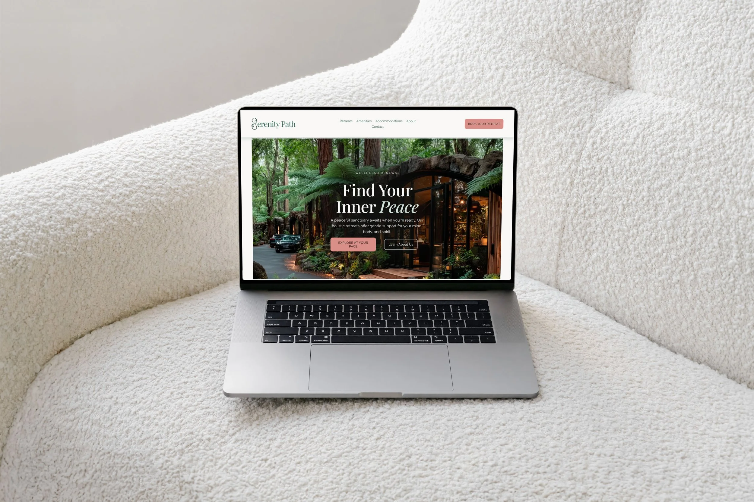
Website design concept for wellness & hospitality
A conceptual website for a holistic wellness sanctuary, designed using trauma-informed user experience design principles. The site prioritises clarity, calm navigation, and emotional safety through soft typography, neutral tones, and spacious layouts. A form-led booking flow supports a more personal, human approach to retreat enquiries. The result is a considered digital experience that mirrors the values of care, trust, and presence found in retreat hospitality.
Squarespace ✦ Concept project ✦ Multi-page ✦ Form-led booking
Pink is Just a Colour
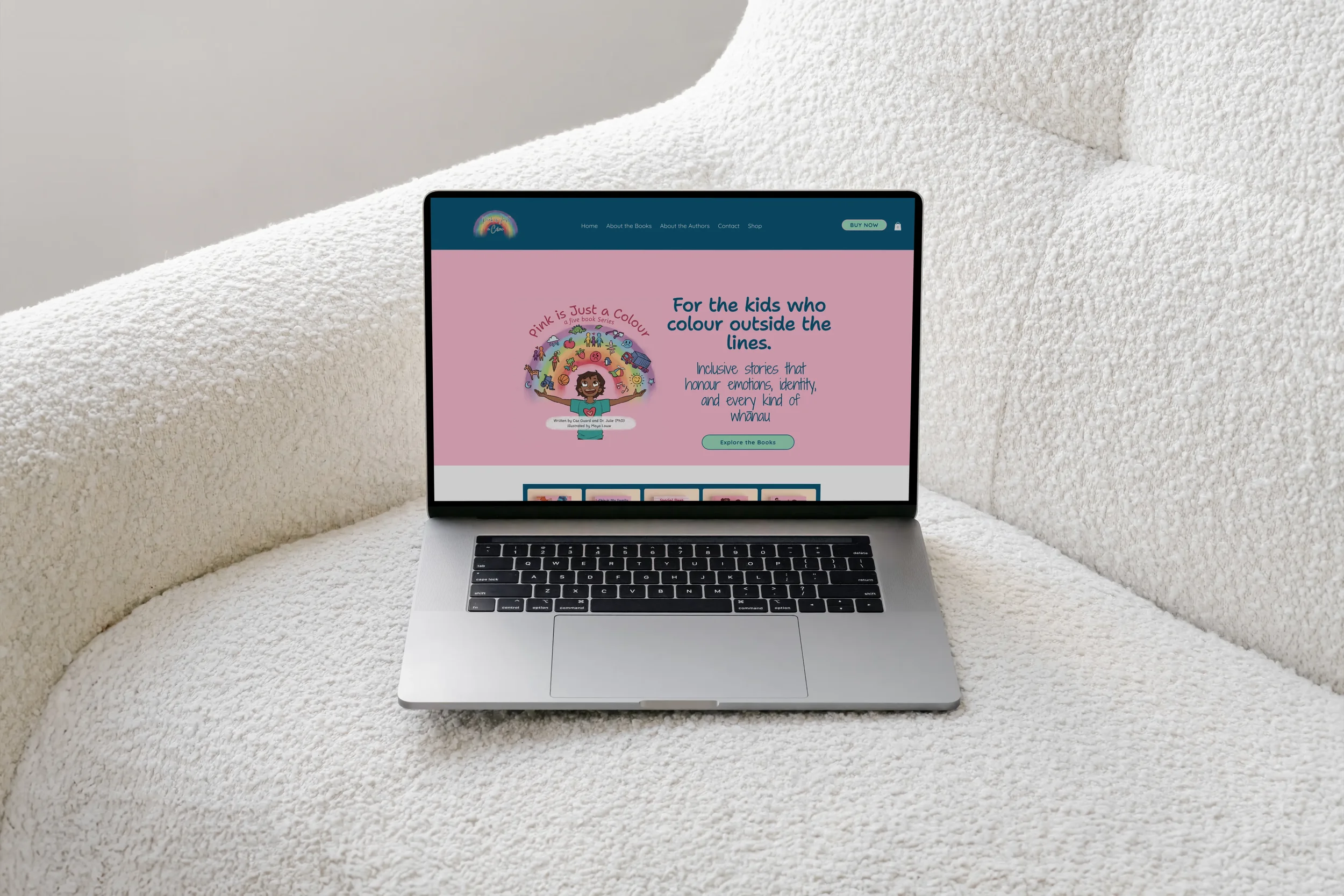
Purpose-led author website for a children’s book series celebrating diversity and inclusion
A warm, accessible Wix website designed to support a children’s book author sharing stories centred on representation, empathy, and belonging. The site balances playful illustration with clear structure, creating an inviting space for parents, educators, and families to explore the books, resources and their message before making a purchase.
Wix platform ✦ E-commerce ✦ Digital downloads
Luxe Gardens
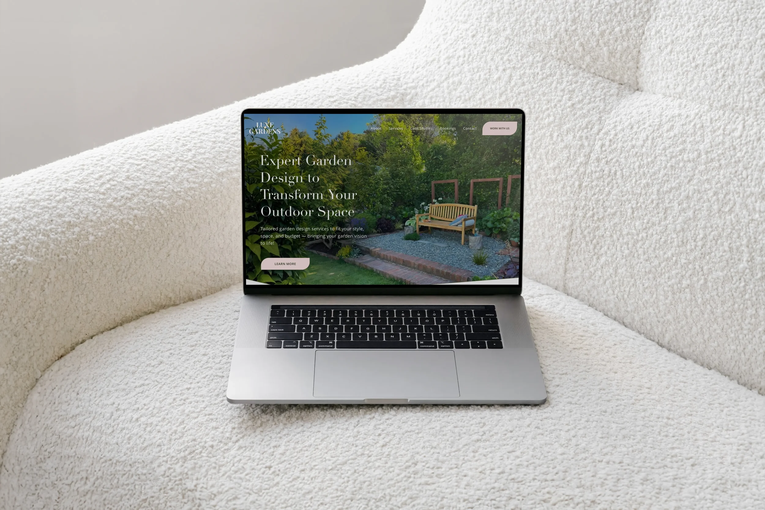
Garden design and education
A grounded digital presence for a lifestyle brand offering both garden design services and educational workshops. The multi-page Squarespace site guides visitors through services and bookings with natural flow, while a calming neutral palette and soft typography support a sense of trust, clarity, and connection to place.
Squarespace ✦ Integrated booking & payment system ✦ Multi-page
Lotus Circle Health
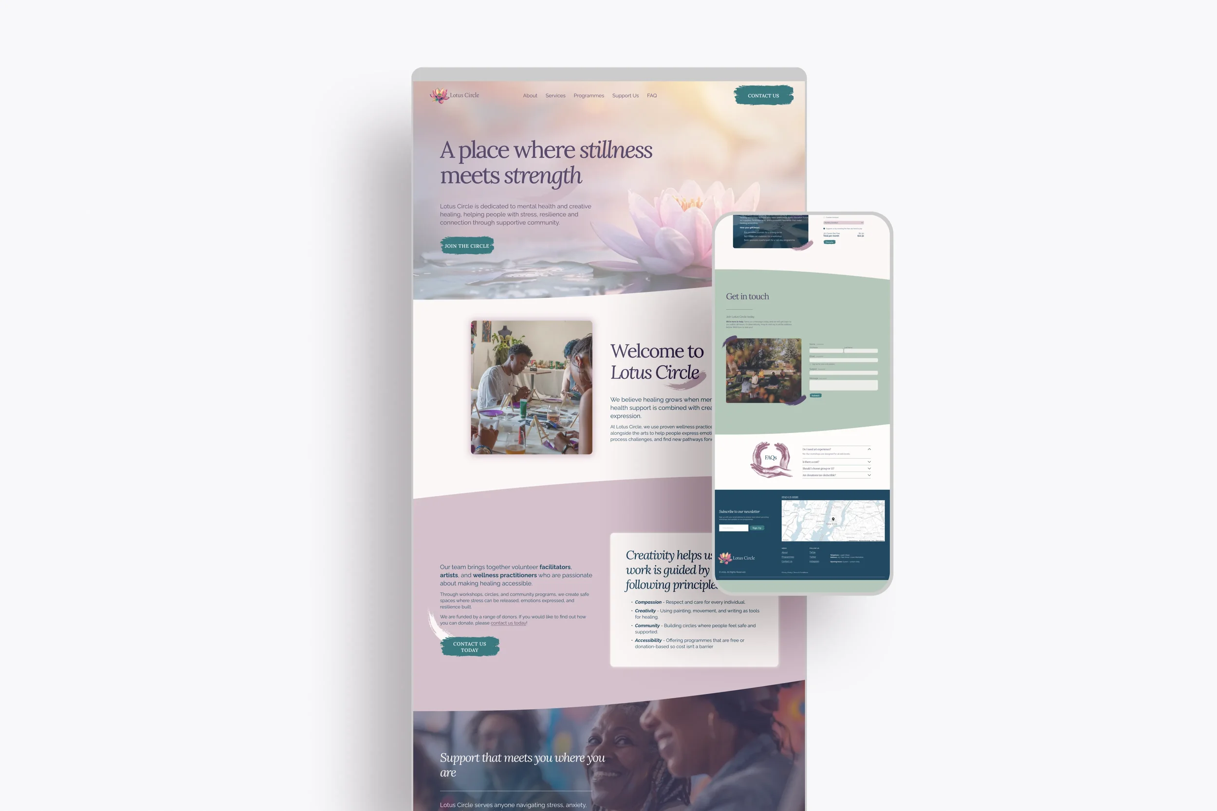
Purpose-led mental health website template for community organisations
A considered, accessible Squarespace template designed to support community-led mental health organisations through calm visuals, inclusive layouts, and clear pathways for connection, support, and engagement.
One-page design ✦ Squarespace ✦ Community wellbeing
LunaFresca Spa
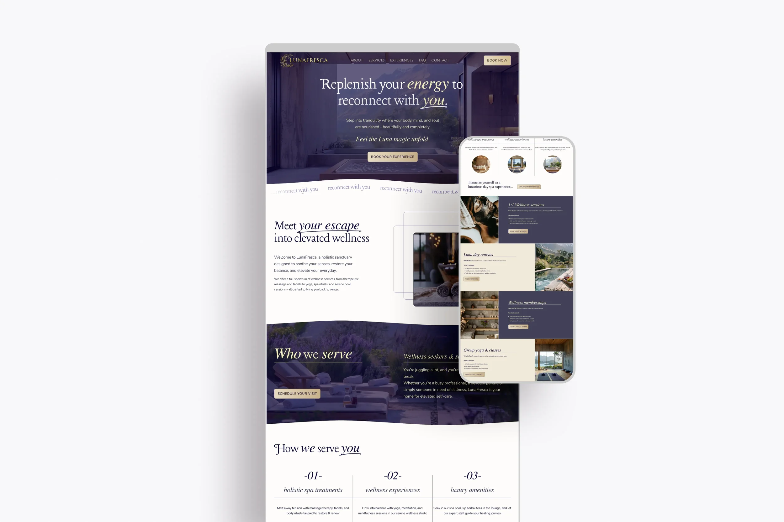
Wellness website template for day spas and retreat-style businesses
A streamlined, ready-to-launch one-page website designed for day spas and wellness providers seeking a calm, professional online presence. Ideal for new or small businesses wanting clarity and ease without the complexity of a multi-page site, all flowing through a considered single-scroll experience.
One-page design ✦ Squarespace ✦ Quick launch
Content & digital design
Considered content and digital design projects spanning research, writing, and publication design. Where the work is less about building a website and more about shaping how people experience, understand, and connect with a brand, place, or service.
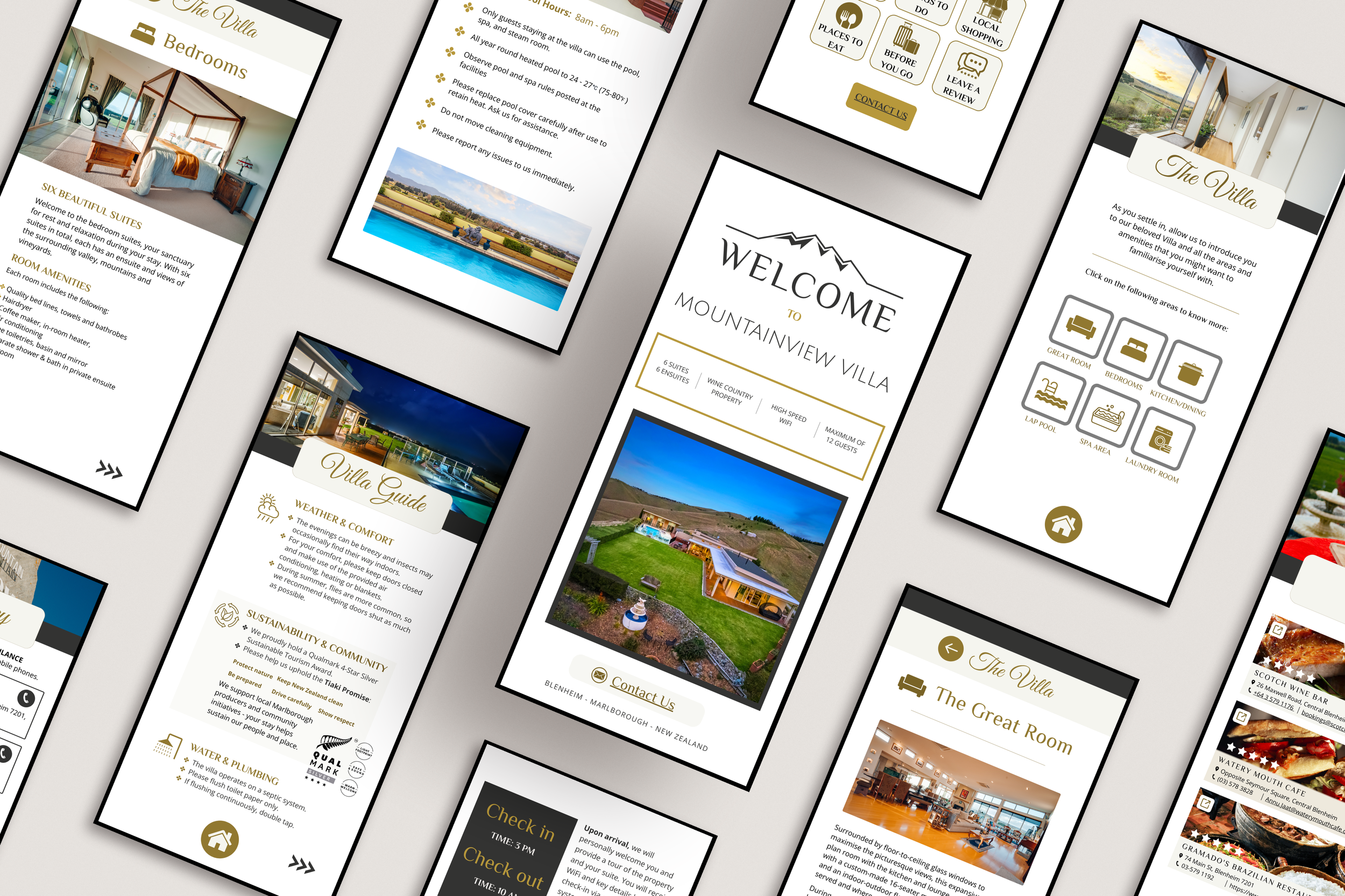
Mountainview Villa NZ
Digital & print welcome book design & content for a luxury villa
Mountainview Villa is a boutique villa in Blenheim, Marlborough, hosted by owners Clark and Didith. The brief was to create an on-brand welcome book that would serve guests from the moment they arrived, feeling warm and personal rather than transactional, and genuinely useful throughout their stay.
The content covers the full guest journey: an introduction to Clark and Didith's story, property overview and facilities, check-in and check-out details, villa rules, WiFi, a detailed walk through of every area of the villa, tips for a comfortable stay, emergency information, and a departure checklist. The second half opens up the region with a curated guide to 18 nearby locations spanning wineries, restaurants, natural attractions, day trips, and historic sites, each with its own description.
The project delivered two formats: a 37-page interactive digital PDF with internal navigation links that give it an app-like feel on mobile; and a 42-page A5 print booklet version formatted for placement throughout the property.
Content research ✦ Property & visit information ✦ Guest experience ✦ Interactive PDF ✦ Hospitality
Branding projects
Strategic visual identity work created to support growing brands, evolving platforms, and community-facing businesses. These projects focus on clarity, accessibility, and brand systems designed to scale across digital and print.
A Pinch of Salt
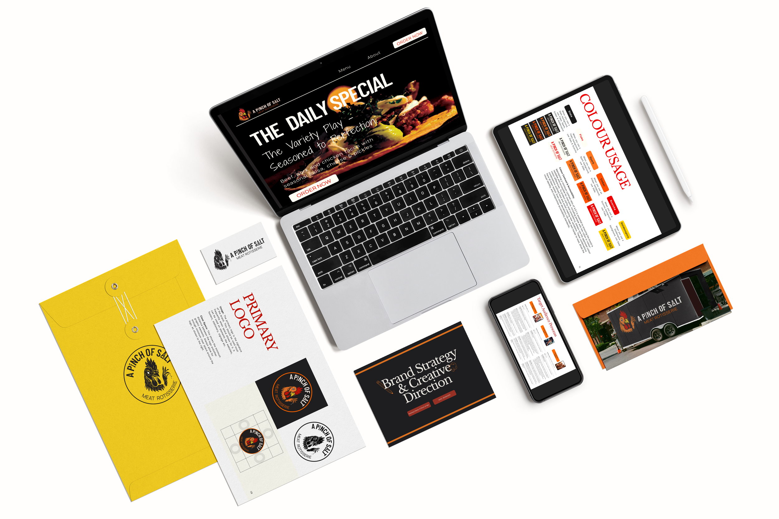
Full brand strategy and identity for a French Riviera food truck
A Pinch of Salt is a chef-driven rotisserie food truck bringing bold, globally-inspired street food to the French Riviera. This was a full end-to-end brand strategy engagement - beginning not with aesthetics, but with research. Audience personas, competitor analysis, market opportunities, and positioning work came first, establishing a clear strategic foundation before any creative decisions were made.
From that foundation emerged the brand voice, creative direction, and visual identity. A complete brand system built to work across packaging, digital, and physical environments, and documented in full brand guidelines for consistent application going forward.
Brand strategy ✦ Creative direction ✦ Visual identity ✦ Brand guidelines
Grow Flow
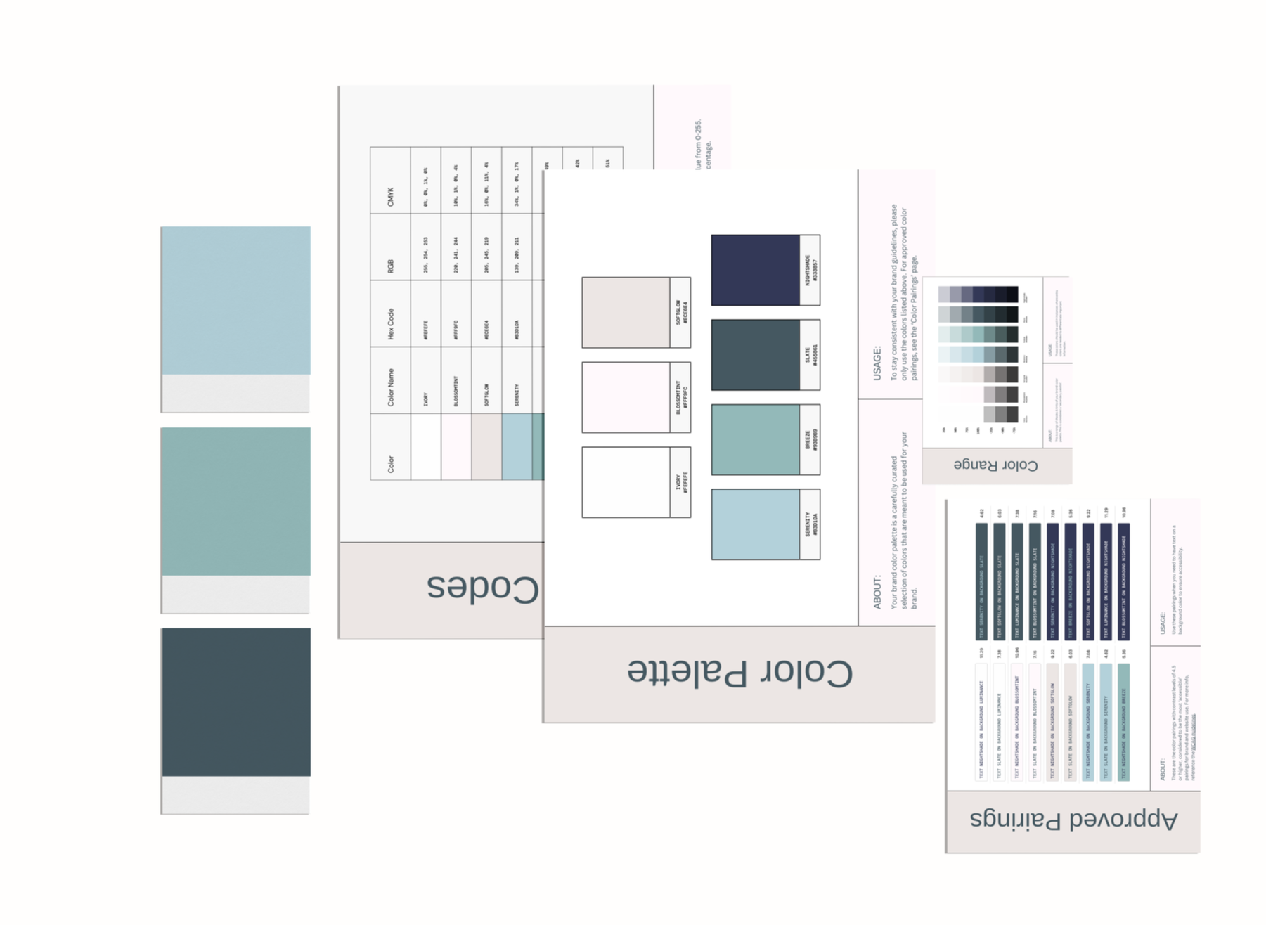
Evolving the colour palette for a growing platform
Grow Flow, a marketing platform and client record management system was ready to evolve its look and feel, moving away from a corporate to softer, more intuitive palette that better resonates with their growing base of female-led businesses.
I created a refined colour system that is softer with improved contrast and tonal cohesion. The new palette was accessibility tested for contrast to ensure legibility and inclusivity. All wrapped up in a 4 page Brand Colour Kit for ease of implementation.
Brand colour kit ✦ Palette redesign ✦ Accessibility review


Kind words
Working with Hannah for my new business adventure was great. She helped me design brand guidelines and a bold, dynamic logo that looks amazing and will look great for my business.
Hannah is very approachable, quick to respond and a true artist at creating business content. Thanks again Hannah, a very happy customer!
— Gareth, Business Owner
A Pinch of Salt
I’m so in love with the brand guide. It’s so professional and beautifully put together, I love it.
It is hard to say what exactly it is, but I love the colours and it just feels great. You are brilliant Hannah, thank you so much!
— Kristine, CEO
Grow Flow, L’Estrange Digital Marketing
Well ... I cried ... so needless to say I think it is amazing! Loving how this looks so much.
— Caz, Co-Author
Pink is Just a Colour
Concept work
Self-initiated and conceptual projects exploring visual identity, storytelling, and brand systems. These studies inform my approach to values-led branding and design.
Flurishine

Concept-led brand identity and website for a nutrition-focused wellness brand
Flurishine is a self-initiated project exploring the creation of a complete wellness brand, from strategy and creative direction through to logo design, visual identity, and website build. Developed as an exploratory study in values-led branding, the project demonstrates a holistic approach to visual identity and digital design within the wellbeing space.

Brand strategy ✦ Creative direction ✦ Visual identity ✦ Website design


Collaborative projects
Selected collaborations and large-scale projects completed in partnership with other creatives. These works reflect my experience across different contexts and storytelling, and demonstrate my approach to establishing clarity, working inside of a design system, and delivering digital projects.
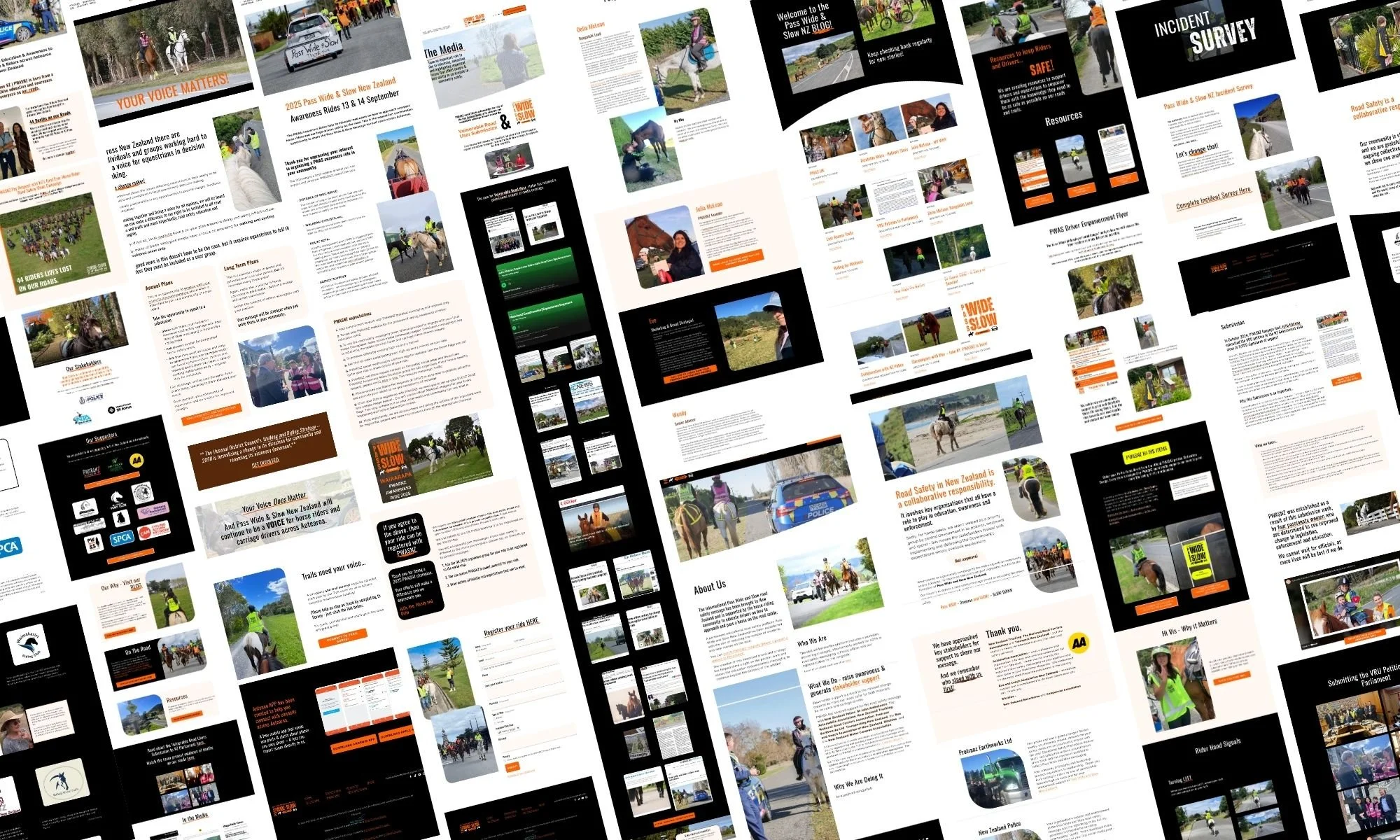
Pass Wide & Slow NZ
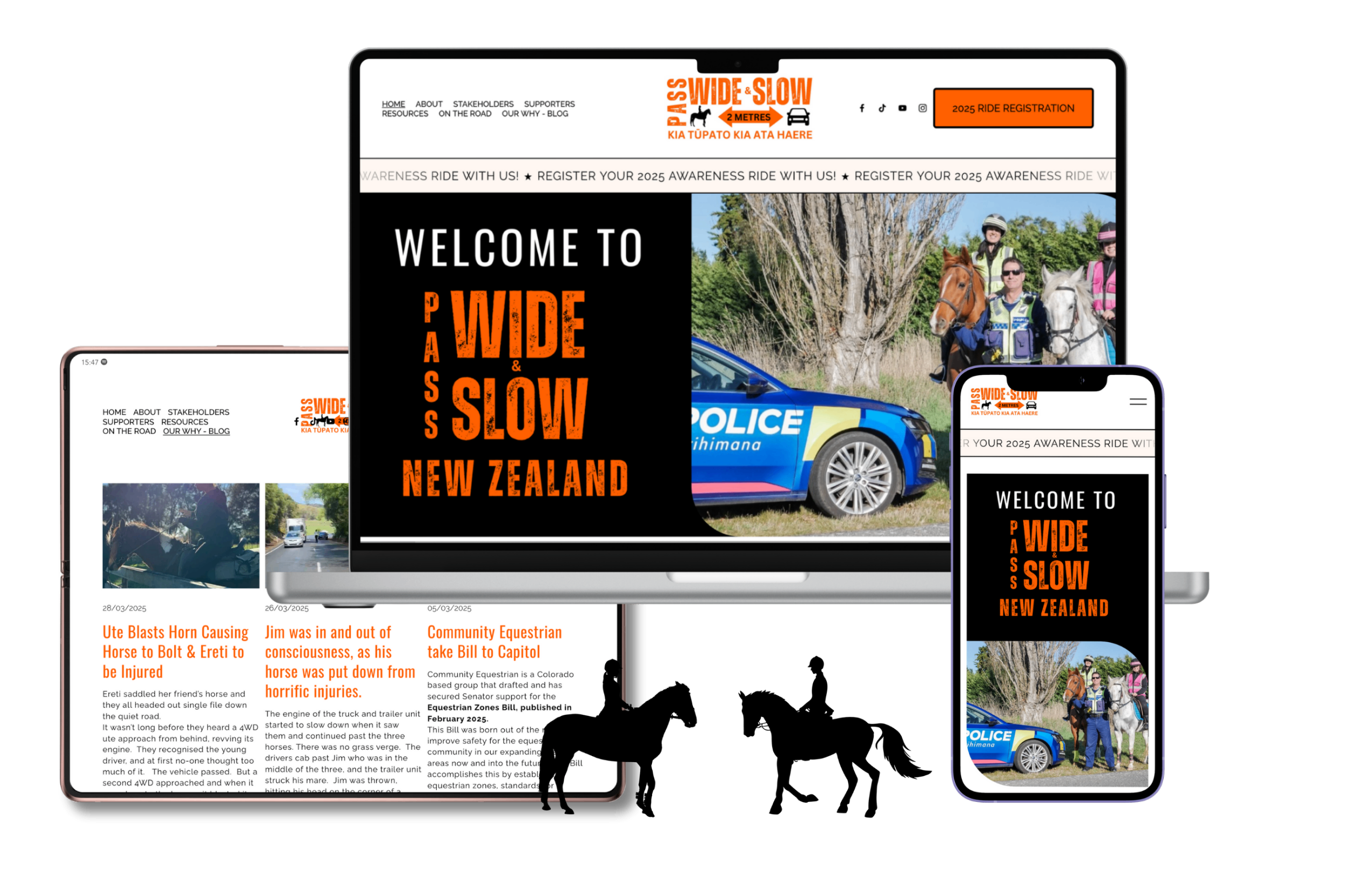
A purpose-driven site designed to educate, support and advocate for change
A multi-page Squarespace website developed to support a public-facing campaign focused on education, advocacy, and community engagement around horse and carriage rider safety across New Zealand. Working within an established visual identity, the project prioritised clear content hierarchy, accessibility, and intuitive navigation to help diverse audiences easily access resources, stories, and safety information. I worked closely with the marketing strategist to build out the site architecture and pages.
The site brought together educational content, petitions, rider stories, and national awareness initiatives within a grounded, easy-to-manage digital structure.
Unfortunately this site is currently offline due to unforeseen circumstances outside of my control. However I am happy to show screenshots of the work if you are interested in understanding more about what was included in this build.
Collaboration ✦ Website design ✦ Content structure ✦ Accessibility ✦ Blog ✦ Squarespace
Casa Selva
The accommodation template built around a sense of arrival
Warm plaster. Deep jungle green. A fictional estate on the Southern Pacific coast of Costa Rica, with a brief to make guests feel like they'd already arrived before they'd even enquired.
Working from a few provided images, I developed the creative direction for this Whitelabel Website Insiders community luxury accommodation template. I developed the colour palette and material language seen here, and built a selection of cohesive images. The concept photography throughout was created entirely using AI image generation, demonstrating what's possible when a professional branding shoot is out of budget for a business owner.
I initially built the home and property pages as the creative foundation for this template. I have since expanded on the final version to create a total of 17 pages by adding pages for accommodation suites, Our Story, Our Team, booking & prices and gift certificates, and editing and refining the rest of the site throughout. The site architecture focuses on telling the story of the property and those that care for it, alongside a curated experiences catalogue and regional travel guide - providing ample space for property owners with a lot to say. The result sits closer to editorial hospitality design than a typical rental template: considered, unhurried, and built around place
Creative direction ✦ Colour strategy ✦ AI art direction ✦ Website template design ✦ Squarespace ✦ Design collaboration
The Wealth Atelier
Colour-first thinking for a finance template that breaks the mould
Finance design has a default setting - cool, corporate, and safe. This design took a different approach: a warm slate, gray and pale rosy cream palette that signals authority without sacrificing approachability, giving financial professionals a template that feels as intentional as their practice.
Built for the Whitelabel Website Insiders community, I led the creative direction - colour strategy, typography, overall mood - before undertaking the website build, and have since made it my own compared with the original. The result is a cohesive, client-ready Squarespace experience built from the palette outward.
Colour Strategy ✦ Website template design ✦ Squarespace ✦ Design Collaboration
Cosmetic Smile Studio
The dental template that finally ditched clinical white
Teal. Sage. Dusty blush. Not the palette you'd expect for a cosmetic dental brand, and that's exactly the point.
Working from provided imagery, I developed the creative direction for this Whitelabel Website Insiders community template: a colour strategy and font pairing that deliberately breaks from the cold, sterile aesthetic that dominates dental design. The result is a template that feels closer to a high-end wellness brand than a waiting room: warm, considered, and quietly confident in a way that makes patients lean in rather than brace themselves.
I built out the home and services pages to carry that energy through - a patient journey that moves with ease, lets the photography breathe, and positions the practice as a place people actually want to be. I have since made this design my own, building out all 13 pages included.
Colour strategy ✦ Typography direction ✦ Website template design ✦ Squarespace ✦ Design collaboration

Wondering if now is the right time?
If something here resonates, I'd love to hear what you're working on.
Let’s chat and explore what’s possible - no pressure, just clarity.